

Components
This article shows you how to work with the components in an Email Design System (EDS), from adding one to retiring it.
A component is a content block that people can add to an email, such as a header, a hero image or a footer. Each component has a template, the HTML it outputs, and fields, the parts people can edit in the email editor.
You do all of this in Component Builder. Changes are saved to your draft, and only reach emails when you apply them.
Add a component
Section titled “Add a component”- In Component Builder, next to Components in the left panel, click +.
- In Name, enter an identifier for the component, such as
hero_banner. It can only contain letters, numbers, underscores and dashes, and must be unique in the EDS. - In Label, enter the name people see in the email editor, such as Hero banner.
- Click Create.
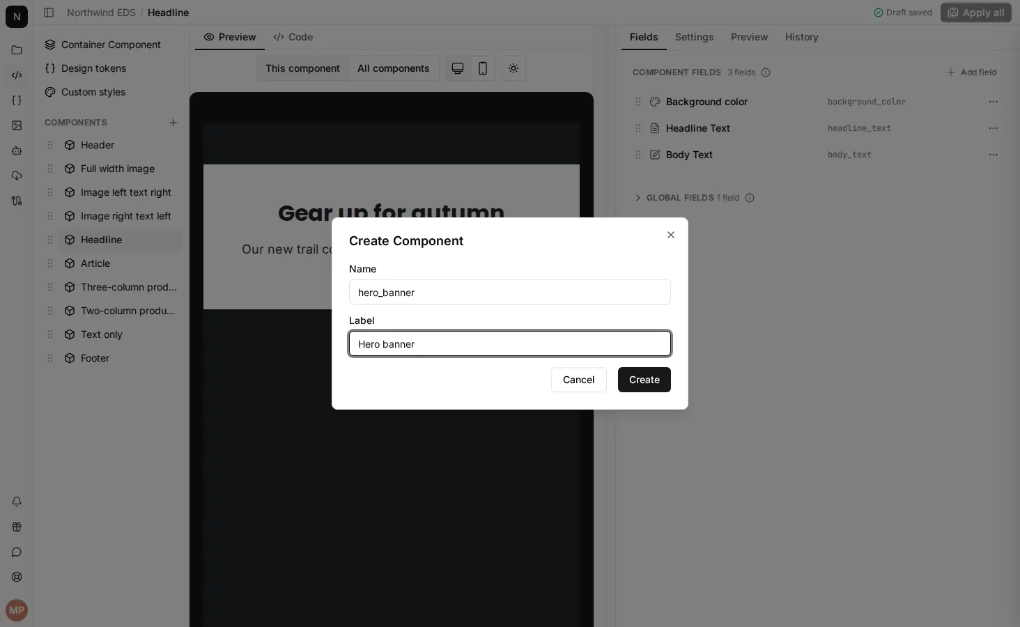
The new component opens with a simple placeholder template. Next, write its template, add fields, describe it and apply your changes. It isn’t available in emails until you do.
Duplicate a component
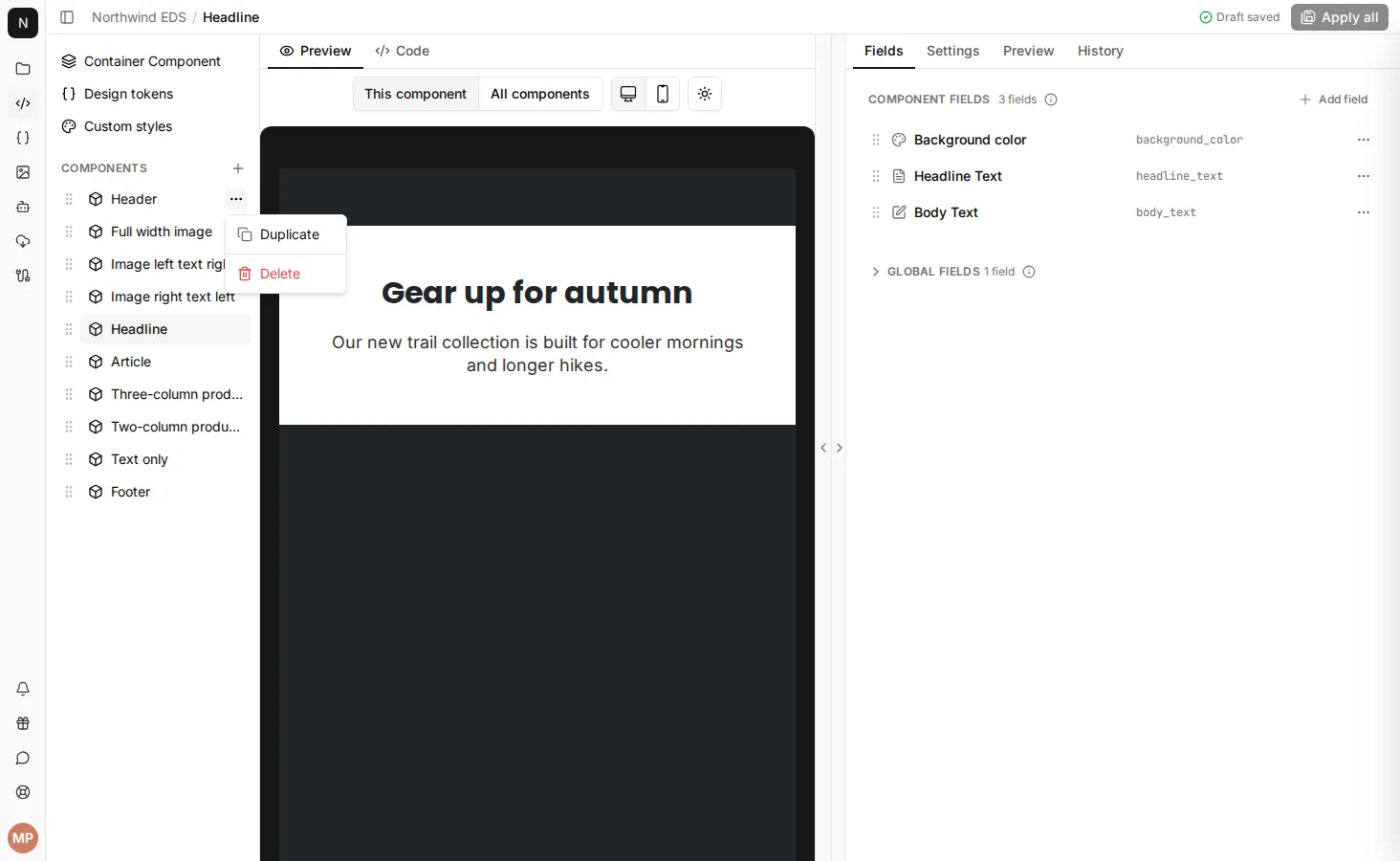
Section titled “Duplicate a component”Duplicating copies a component’s template, fields and description. It’s a quick way to make a variation, such as a hero with the image on the other side.
- In the left panel, hover over the component and click … > Duplicate.
- Change the Name and Label if you want to.
- Click Duplicate.
Edit a component’s template
Section titled “Edit a component’s template”- Open the component in Component Builder.
- In the middle panel, click Code.
- Edit the template. To see your changes as you type, click Preview in the right panel.
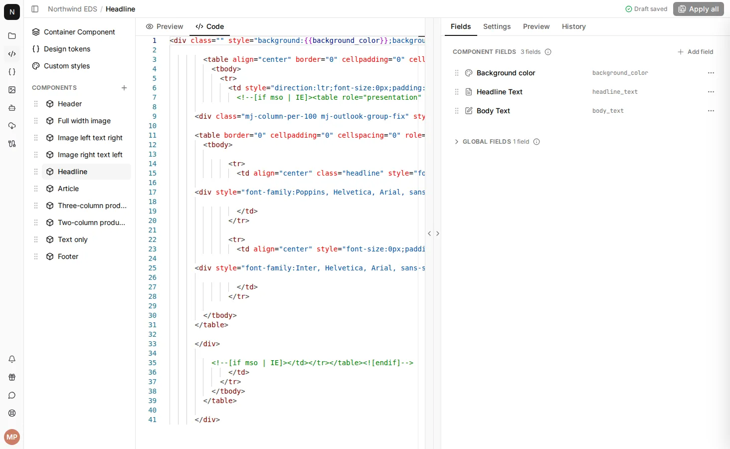
See Component templates for how to write templates.
Change a component’s label
Section titled “Change a component’s label”The label is the name people see for the component in the email editor. Changing it is safe at any time.
- Open the component in Component Builder.
- In the right panel, click Settings.
- In Component label, enter the new label.
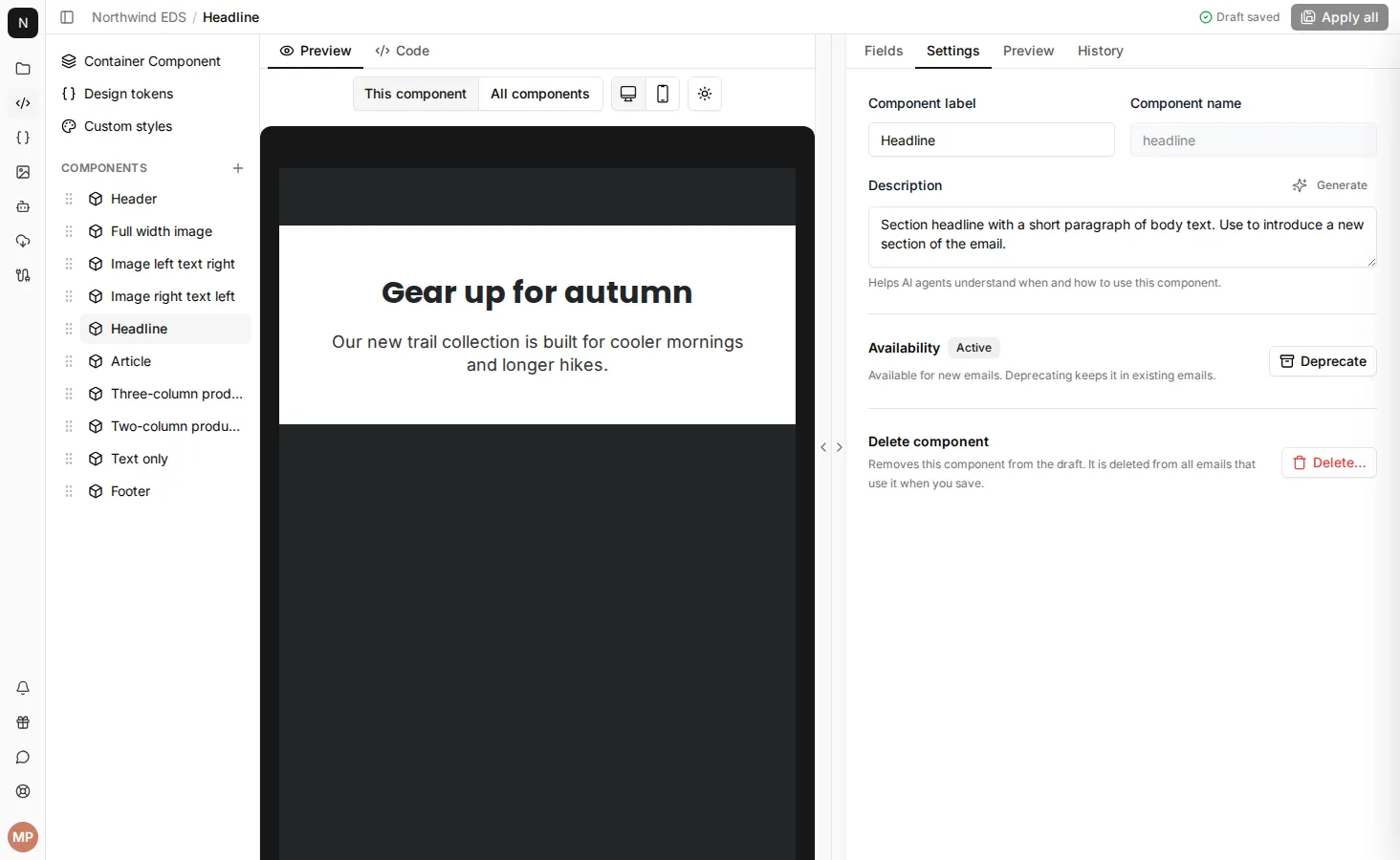
The Component name can’t be changed. If you need a different name, duplicate the component and give the copy a new name.
Describe a component for AI agents
Section titled “Describe a component for AI agents”EmailShepherd’s AI agents read each component’s description to decide which component to use, and where to put it, when they build or edit an email. A clear description helps them choose well.
- Open the component in Component Builder.
- In the right panel, click Settings.
- In Description, describe the component. To have AI write a first draft from the component’s template and fields, click Generate, then edit the result.
Say what the component is and when to use it. Be specific about where it goes in an email, what it’s for, and any rules it should follow. Descriptions can be up to 1,024 characters. For example:
Full-width image with headline and CTA. Use as the first component in promotional emails.
Compact two-column footer with social links and an unsubscribe link. Always place this as the last component in the email.
Single-line spacer used to add vertical breathing room between sections. Never use this before the header component or after the footer.
Three-up product grid showing image, name and price. Use for promotional emails with three or more products; prefer the single product hero when featuring just one.
Plain-text quote block for customer testimonials. Use sparingly — no more than one per email.
Reorder components
Section titled “Reorder components”The order of components in the left panel is the order people see them in the email editor. To change it, drag a component by its handle to a new position.
You can also drag components on the EDS’s Components tab. Changes you make there are saved straight away, without going through your draft.
View and restore earlier versions
Section titled “View and restore earlier versions”Each time changes to a component are applied, EmailShepherd keeps the version it replaced.
- Open the component in Component Builder.
- In the right panel, click History.
Each entry is an earlier version, with who saved it and when, newest first. The version in use now isn’t listed. The History tab appears once a component has been applied at least once.
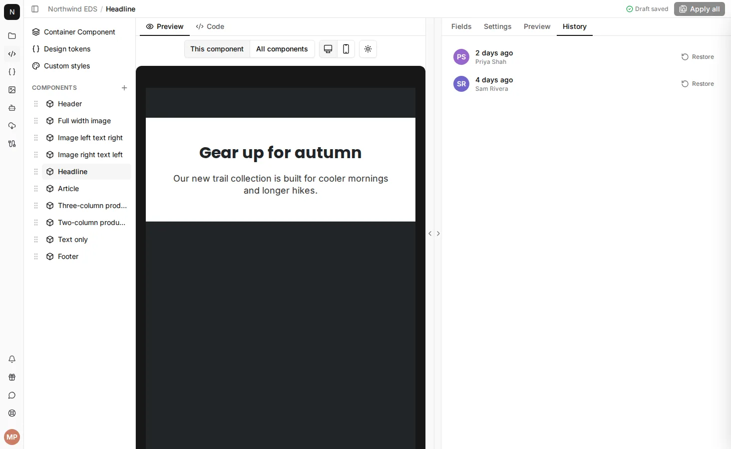
To go back to an earlier version, click Restore on it. Its label, template, fields and description replace the current ones in your draft. Check the preview, then apply your changes. To undo the restore before applying, discard your changes to the component.
Deprecate a component
Section titled “Deprecate a component”Deprecate a component to stop it being added to new emails, while keeping it working in emails that already use it. Use this to phase out a component without breaking anything.
- Open the component in Component Builder.
- In the right panel, click Settings.
- Under Availability, click Deprecate.
Once you apply your changes, the component no longer appears in the email editor’s list of components. To make it available again, click Restore under Availability.
Delete a component
Section titled “Delete a component”- Open the component in Component Builder.
- In the right panel, click Settings.
- Under Delete component, click Delete…, then click Delete to confirm.
You can also hover over the component in the left panel and click … > Delete.
Until you apply your changes, a deleted component stays in the left panel with a line through it. To bring it back, click it, then click Restore.
If you delete a component by mistake and you’ve already applied your changes, add the component again with the same component name. The content in your emails isn’t lost, so it comes back too.
You can’t deprecate, delete, duplicate or reorder the container component.